Tuesday, December 11, 2012

Guest Blog: Why I represent Paul Creedon, Fine Artist


In 2010 I started a freelance graphic and web design business called Pat Creedon Design, Inc. I came up with the name (mine) and had it incorporated. The plan was to market my extensive abilities at branding and creative concepts to help small businesses grow. I got quite a few clients once word got around. I designed a menu, several business cards, several websites, postcards, PowerPoint templates, Social Media graphics, and logos. I also signed up with a few creative staffing agencies that placed me at area corporations for onsite stints. And I worked freelance for my previous employer. I even did some work for non-profits. Overall it was a sucessful company and still is nice to have as a sideline and back up to the fulltime employment I was offered in May 2012.

So why did I change my business model to focus more on Paul Creedon, Fine Artist? First and foremost, he’s my husband! But beyond that I am a great fan of his work. I always have been. But his recent work in pastels is really fulfilling his potential in my opinion. I want everyone to see it. To see it is to love it. Though many art collectors are drawn to a more abstract style and Paul may never achieve trendiness, he produces consistent, high-quality art for the lover of colorful, recognizeable still lifes and landscapes. If you fit that bill then welcome. Paul has a wonderful personality that really comes through in his blog and his art. Get to know him here and on Twitter, @pecreedon. I will be designing his branding and promoting his art to galleries and by entering local art shows. So look for his work on a wall near you or better yet, purchase a Paul Creedon for your own wall! To do so, simply email me, Patricia Creedon. Samples and pricing will be sent away!

Tuesday, December 04, 2012

3 Top Social Media Marketing Tips for the Artist by Lorraine Duncan


Making Art
I have been doing Social Media Marketing for a while now. The way I see it Social Media is crucial when it comes to marketing your art online. Social Media gets your name out there in a big way. It gets you noticed. Getting noticed can boost your art business to success. 

As I sit here and write this post I want to share some of my biggest tips that will produce engagement for artists. 

Use Facebook


My first tip is that utilize Facebook to your advantage. The cover photo and the profile and the tabs are some great pieces of real estate on your page. Your artwork is your product. Post your artwork in such a way where you are marketing to your gift.  

It’s all about content


My second tip is that it’s all about content. You want to focus on your target market or your ideal client and give them quality content. You want to share stuff that others can learn from. You want to share some of your artwork and something personal about it to make the connections. The bottom line is that audiences engage with content that they find interesting. They usually do this by liking, sharing or retweeting. Keep your content fresh by posting some inspirational stuff. You will be amazed at the relationships that begin to happen online.

Let them get to know you


My last tip is let people get to know you. My experience with art is I make my art buying experience based on more than just a pretty drawing but the decision is made on who the artist is. I want to know about the artist. We do business with who we know, like and trust. Use your Social Media Platforms to give potential buyers frequent glimpses of you and your creative personality. Use your professional pages on Facebook and LinkedIn with frequent posts about your artistic activities. This will let people get to know you. And don't forget Pinterest, another way to show your followers more of your unique gift in art. There is over 650 million people using Facebook, 160 million members using LinkedIn, and nearly 20 million people using Pinterest. What a great way to get would-be art collectors to know you through social media.

Lorraine Duncan is a guest blogger this week. She’s a colleague whom my wife met at BNI. Now she manages my social media for me. Lorraine started out as a business coach but has swiftly moved into the social media angle of the business. You can learn more about her at www.footpathbizcoaching.com ENJOY HER WRITING

Tuesday, November 27, 2012

Capturing the complexity of a landscape

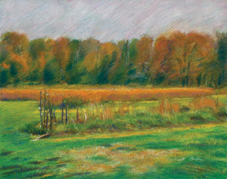
Field and trees in a Connecticut park
Field and trees in a nearby park.
Landscapes are never frozen in time the way a still life is. Nature is changing from one moment to the next, and somehow that has to be put across to the viewer. 

Besides, outdoors is a lot more complicated than indoors. Only God can make a tree and all that, and so much more is going on all at once in the great outdoors that I don't believe you can freeze a moment and have it seem anything like the reality of nature. 

A change of style to suit the landscape

So I work rather more loosely, using chalks, usually NuPastels, and trying to avoid patches of pure color. Pure color can be the dramatic highlight of a still life: think of the white reflections on a bottle or a blotch of bright red on an apple. Yet there doesn't seem to be anything resembling pure color outdoors. Usually something looks like a familiar color but if you look closely it is really a zillion colors combined that give the illusion, at first glance, of one color. 

Tuesday, November 20, 2012

Reflections on creating a still life

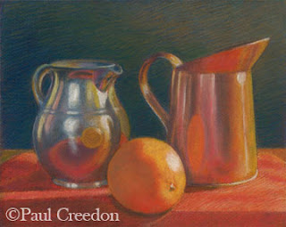
Three objects, a still life by Paul Creedon
Three objects, a still life by Paul Creedon.
I think of still lifes and landscapes as being quite different in purpose and mood. 

(Digression: I drew plenty of human figures back in the day, and the day was about 25 years long, and now I just want to do other things. Nonetheless, the teachers were right in saying that drawing the figure is the best way to learn how to draw. It's true, I think, that if you can draw a person you can draw pretty much anything else. Michelangelo believed it. End of Digression.)

Lighting in a still life

Still lifes usually have one main source of illumination. The objects don't move, and the fascination seems to lie in recognizing everyday things like fruit and bottles and tables, presented in new and different situations. Sometimes I look at something I've owned for years, and I feel as if I never saw it until I painted it. 

The light reflects from say, an orange, onto a silver pitcher, and the pitcher becomes something brand new. But the light and the situation have to be constant, and the pitcher and orange have to be depicted realistically, because we have to recognize the them immediately. So I work in a tight manner, and use pastel pencils with occasional forays into the land of the big pastel stick (to get a splotch of pure color) to make the onlooker's eye go where you want it to. A lot of the work is done before hand, when setting up the objects in the scene, and the trick is to represent what is laying there quietly in front of me, pretending to behave itself. 

Of course there is another consideration. People like to go right up to a still life and look as closely as possible at the execution. I know I do. So the technique needs to hold up under inspection. 

To be continued.

Monday, November 12, 2012

The Boss

Changing techniques to suit the subject


landscape in a Connecticut park
Cool tones for a cool afternoon.
Here are two pastels, sized 5" by 7". Both depict scenes from Irwin Park about a mile from where I live. The first is quite loose in style, depicting an open field on a windy, sunny day. The "palette", that is, the colors used most prominently in the pastel painting, tend toward blue and white with a little purple added. These are often referred to as cool in tone, and they make the viewer feel that way. That is, cool as in temperature, not attitude. It was a bit chilly that afternoon.

I used a lot of long chalk strokes, hoping to convey the continuously changing patchwork of light caused by the swaying branches and moving foliage around me. The viewer might even 'feel' the vibrant atmosphere.

Getting warmth to show through 

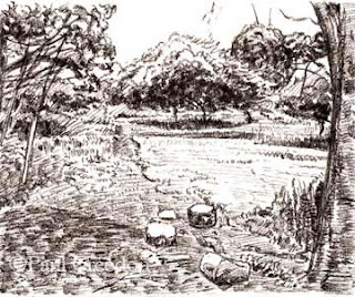
Path through some Connecticut woods
Stillness goes with warmer tones in this scene.
The second painting shows a path about a third of a mile away, running through a small valley sheltered from the elements more than the field shown in the first picture. The canopy of trees is cut off from the wind, producing an environment that feels warm and still.

So the painting tends to use warmer colors, that is greens with a yellow tint, and even the purples have a dose of orange in them. You can still sense the same blue sky with hints of white in it. The drawing is much more traditional, relying a bit on techniques picked up from a 19th century book on how to draw trees. Too much line work would have distorted the sense of stillness. The patches of light are there, but are not constantly shifting.

A technique called scumbling


I did employ a nice late 20th Century technique called scumbling on the lower right-hand corner; I dragged the side of a large yellow pastel over a section of dark green to create the illusion of sunlight filtering through onto a patch of grass and small shrubs.

Although one painting appears tightly rendered and the other full of aggressive line strokes, both pieces are equally abstract. 

Tuesday, November 06, 2012

Get to know the differences in art medium


Two different drawings, done on two different sized drawing pads (but both on acid free paper!), using different media, depicting two different stopping points on the same orchard path in the New Canaan Nature Center.

Effect of dark chalk in a landscape

Sunny Orchard by Paul Creedon, 2012
Sunny Orchard by Paul Creedon, 2012.
The first drawing shows the entrance to an orchard, with a patch of woods on the left and a large apple tree in the center. The shape of the tree and the dark shadow underneath drew my interest: it formed a near triangle, and gave a perfect center of attention to the scene. I used dark chalk on white paper to convey the stark impression of bright sunlight in the orchard.

Softened light using graphite

A smaller, graphite lead drawing was done further down the path, and the heavy shadow under the apple tree can be seen on the right hand side. The trail continues toward Rt. 124 in the distance.

Orchard Shadow by Paul Creedon, 2012
             Orchard Shadow by Paul Creedon, 2012.

At that point the shadow of the tree is directly to the right and the woods are still following along on the left, and the feel of bright sunlight is gone. I had reached this second vantage point on an overcast day, whereas I encountered the previous scene on a sunny afternoon. The focus shifts to the path and to the way down to the road. So I used a lighter lead pencil on a softer tone of paper to suggest the change of atmosphere. After I scanned the drawing I noticed the inadvertent cue at the end of the lane: the shadow between the bushes looks like a hand with a finger pointing to my destination.

Since it's election day, why not vote for your favorite in a comment below!

Tuesday, October 30, 2012

Note cards for any occasion

These unique notecards were designed by Pat Creedon Design, Inc. using original art by Paul Creedon. They are currently available at Koenig Art Emporium in Darien, CT or directly from Pat Creedon Design. Purchase them by the package of 8, or one at a time. Four of Paul Creedon's pastels are featured (2 of each in the packages of 8) and they are blank inside.

notecard from original art by Paul Creedon

notecard from original art by Paul Creedon

notecard from original art by Paul Creedon

notecard from original art by Paul Creedon


Tuesday, October 23, 2012

Coloring outside the lines


Four Apples original pastel painting
Four Apples original pastel painting.
The first still life was framed and hung in the solo art show held last Fall. I had looked forward to seeing what it looked like up on the wall and was disappointed. It had been hung in the frame crooked because I had not colored in the part beneath the table edge all the way to the pencil guideline line I had drawn. Let this be a lesson to all: don't keep it between the lines. Let things bleed on past the borders a little. In other words, coloring outside the lines can be a good thing!

Second, as an in-law pointed out, the apples looked a bit like tomatoes. They were too shiny. You might say I was relieved it didn't sell so I could see if I could fix the problem. Later on the framer we use needed a favor involving taking the pastel out of its frame so he could use it in another project.

But then the apple/tomatoes still life was left on a shelf for a long time. I was sick and didn't quite know what to do with the picture anyway. 

A solution is found

Four Apples still life as it is now
Four Apples still life as it is now.
This week I sprayed fixative over the whole painting and drew a "new" version over the old one. This second edition is less colorful, (on purpose; maybe being ill affected my outlook on life?), and the apples were toned down, roughed up a bit, and simplified a little. Not too much, since the point was to have them look fairly realistic and a bit less like tomatoes! In any event, this is what it looks like now.* The picture was painted out to the edges and beyond, so when it gets reframed, the table edge should be level. I think it succeeds now as a pastel painting of apples. What do you think?

*When I was ten, my father had a very difficult time convincing me that tomatoes are not fruits, but rather are vegetables. I insisted that vegetables come in dull green and brown colors, and certainly not in cheery bright red. On the other hand, he pointed out that fruits taste good, and thus won the argument.