Showing posts with label abstract. Show all posts

Thursday, February 07, 2013

Going Realistically Abstract

My attempt lately is to abstract my landscapes more. I feel it's important to be able to do them realistically before trying to go more abstract. Because then the abstraction is more informed and has the structure needed to give it strength. See what I did with the same scene twice:

Pastel of trees and a stone wall

Pastel of an abstract scene of trees and a stone wall

Monday, November 12, 2012

Changing techniques to suit the subject


landscape in a Connecticut park
Cool tones for a cool afternoon.
Here are two pastels, sized 5" by 7". Both depict scenes from Irwin Park about a mile from where I live. The first is quite loose in style, depicting an open field on a windy, sunny day. The "palette", that is, the colors used most prominently in the pastel painting, tend toward blue and white with a little purple added. These are often referred to as cool in tone, and they make the viewer feel that way. That is, cool as in temperature, not attitude. It was a bit chilly that afternoon.

I used a lot of long chalk strokes, hoping to convey the continuously changing patchwork of light caused by the swaying branches and moving foliage around me. The viewer might even 'feel' the vibrant atmosphere.

Getting warmth to show through 

Path through some Connecticut woods
Stillness goes with warmer tones in this scene.
The second painting shows a path about a third of a mile away, running through a small valley sheltered from the elements more than the field shown in the first picture. The canopy of trees is cut off from the wind, producing an environment that feels warm and still.

So the painting tends to use warmer colors, that is greens with a yellow tint, and even the purples have a dose of orange in them. You can still sense the same blue sky with hints of white in it. The drawing is much more traditional, relying a bit on techniques picked up from a 19th century book on how to draw trees. Too much line work would have distorted the sense of stillness. The patches of light are there, but are not constantly shifting.

A technique called scumbling


I did employ a nice late 20th Century technique called scumbling on the lower right-hand corner; I dragged the side of a large yellow pastel over a section of dark green to create the illusion of sunlight filtering through onto a patch of grass and small shrubs.

Although one painting appears tightly rendered and the other full of aggressive line strokes, both pieces are equally abstract. 

Tuesday, September 04, 2012

Pond in the Woods


The pastel landscape painting here depicts a pond located in Devil's Den preserve in either Weston or Redding, CT, or maybe both. It's hard to tell from the research I did online using my iPad app by Google. It seems the genius code warriors who wrote the Google maps app on my iPad didn't include any town borderlines, so your guess is as good as mine.
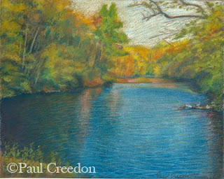
fall pond
Fall foliage, wind-blown pond in a Paul Creedon pastel.
Anyway, I chose this fall landscape scene with colorful foliage and pond because I had absolutely no idea how it could be done at first.

After much struggling I eventually got the foliage right in the top left-hand quadrant, or in any event as right as I was going to get it at the time. Then the time came to work on the water.

How to Depict the Wind Blowing on the Water


The next problem was to how to depict the wind blowing on the water of the pond. After a couple of attempts at doing it the way the books told me to do it, (and failing in a truly spectacular fashion), I discarded everything I had ever learned about pastel painting, grabbed a fistful of pastel pencils, and started scribbling. The bottom left hand corner came out right on the first try.

Using Layers of Pastel Sprayed with Fixative


The bottom right-hand portion didn't work out so easily. There are around 7 or eight layers of utterly horrible stuff under what you now see, and each try was sprayed with fixative and worked over again. The last version of the pastel finally got me where I wanted to go.

If you have looked at the still life paintings on this website you may have noticed they tend heavily toward a representational approach. The above painting is the most abstract I have done thus far, and was harder to do than any 9 put of 10 of the other paintings. A friend from college days looked at it, and said it looked more real than reality. 

Tuesday, July 03, 2012

The Need to Simplify or Abstract Art


Marble Quarry Pastel Landscape by Paul Creedon
Marble Quarry Pastel Landscape by Paul Creedon.
As a pastel artist I find that the most formidable challenge in the visual arts is the need to simplify (or abstract) the appearance of the object I intend to paint with my pastels or draw with sanguine chalks. My artist's instincts seem to resist the idea of leaving out some of what I see when I compose a new still life or create a landscape. But given my years of experience and training I know that I must in order to arrive at a better picture.

And it will be a better picture. That is because a lot of extraneous stuff will be left out that would only confuse the viewer and art lover. Even if they are someone who is used to looking at fine art. Knowing what to leave out also helps to convey the one major thought that I want a person to see and come away with. Perhaps it's the roundness of a fruit in a pastel still life or the light coming through the trees in a landscape drawing.  Either way I know the picture is enhanced when there are fewer distractions.

To see more of my pastel art and to make a purchase contact Patricia Creedon at 

Wednesday, March 28, 2012

When Editing Photos for Reference...

I’m not too finicky about the color however, and I don’t lose sleep over whether the printout is terribly good. It’s just a jumping off point. If the reference is too good, it can actually limit my options.

Some might say that perfectionism is a virtue, but in my case I think it is anything but. The need to have everything as good as it can possibly be starts to feel like a curse after a while. It makes me contend with guilt issues if I don’t put in every blade of grass and every leaf and every bump on every tree trunk.

Yet if I have learned anything about making a good piece of art, it is the absolute need to leave a lot of things out. Even better, learning to leave the right things out.

Perfectionism pushes me unwillingly toward a sort of hyper realism, but experience and knowledge pull me back toward the abstract, used as a method to correct the tendency to put too much in. After all, to abstract something from a whole is to take it out of that whole.